LabVIEW开发 XY Graph DoubleScale双刻度 点击:138 | 回复:0

LabVIEW开发 XY Graph DoubleScale双刻度
试图在同一张图上绘制多个xy图。其中一些图需要在 Y 轴上以不同的方式缩放。如何动态打开其他 y 刻度并将多组数据绘制到不同的刻度,从而允许所有数据同时显示在不同的图上。
如何动态打开其他y刻度"
只需要使预定义的刻度可见或不可见。我不知道如何在LabVIEW中动态创建新的秤。
"如何将多组数据动态绘制为不同的比例"
如果您的数据存储在2D数组中,则必须使用索引数组函数对其进行切片,以分离数据集(让我们称它们为通道)。然后,您必须决定显示给定通道的比例。您可以使用最大值或最大-最小振幅等。
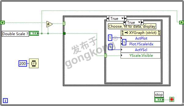
示例vi(双刻度)有2个部分:
1 它生成一系列数据,在2个通道中,排序它们以在XY图中显示具有数组(簇的(x数组和y数组坐标))。
2 它在连续循环中读取布尔值,如果布尔值发生变化,则在小数位数 0 和小数位数 1 之间交换第二个通道。图形属性节点必须按以下顺序使用:
- 选择通道数据(写入活动绘图)
- 将数据发送到比例(写入 Y 比例索引)
- 选择比例(写入活动 Y 比例)
- 使其可见或不可见(写入可见)
但是,在单个图形窗格上绘制大量曲线始终是一项艰巨的挑战。主要问题是保持可读性。
当数据与具有不同振幅或单位的事件相关时,最好绘制最多4条曲线/图表,因为大多数人很难弄清楚哪条曲线是什么。
您将不得不非常仔细地选择颜色,尺寸等...以方便识别。请记住,很多人在某种程度上是色盲。
就个人而言,我很少绘制/使用超过3种不同的比例。
当然,如果您决定将数据动态分配到给定比例,则难度将会增加!选择数据系列的目的地不是一个大问题,但是您将如何告诉读者这条曲线在A级上,而其他曲线在B级(或C或D)上。你可以玩颜色,但是你将如何轻松识别给定的一系列数据,而它的颜色可能会改变?..
More explanations : your question had two parts :
1/ "How does one dynamically turn on additional y scales "
You only need to make a predefined scale visible or not. I don't know how to CREATE a new scale dynamically in LabVIEW.
2/ "How does one dynamically plot multiple sets of data to different scales"
If your data are stored in a 2D array, you will have to slice it, to separate the set of data (let's call them channels), using an index array function. Then you will have to decide on which scale a given channel will be displayed. You may use the max value, or the max-min amplitude, etc.
The example vi (Double scale) has 2 parts :
1/ it generates a series of data, in 2 channels, order them for display in a XY graph has an array of (clusters of (x array and y array coordinates)).
2/ it reads a boolean value in a continuous loop, and, if the boolean value changes, swap the second channel between scale 0 and scale 1. The graph attribute node has to be used in the following order :
- select a channel data (write to Active plot)
- send the data to a scale (write to Y scale index)
- select a scale (write to Active Y scale)
- make it visible or not (write to Visible)
However, plotting a large number of curves on a single graph pane is always a difficult challenge. The main issue is to maintain READABILITY.
When the data relate to events with different amplitudes or units, it is better to draw a maximum of 4 curves/graph, because most of the people will have difficulties in figuring which curve is what.
You will have to choose very carefully the color, the size, etc... to ease identification. Remember that a lot of people are colorblind to some degree.
Personnaly, I rarely draw/use more than 3 different scales.
Of course the difficulty will be increased if you decide to allocate dynamically the data to a given scale! Choosing the destination of a data serie is not a big issue, but how will you tell the reader that THIS curve is on scale A while others are on scale B (or C or D). You could play with color, but then how will you identify easily a given serie of data, while its color may change ?..
So, be carefull ! :
:
更详细的内容,参加如下附件的介绍。
LabVIEW、LabVIEW开发、LabVIEW编程、LabVIEW程序
上文中提到的例子和资料,均在word中的附件里,可点击下载。进一步了解,可联系们。
http://www.bjcyck.com/nd.jsp?id=417#_np=2_358


楼主最近还看过
- 国内首款不限点免费的组态软...
 [5371]
 - WIN7 64位安装AB授权[6399]
- 哪里有Intouch10.1的I/O Ser...[2081]
- TRACE MODE在分布式可视信息...[2442]
- 西门子Insight3.4软件[2292]
- mcgs6.2产生安装盘的问题[2019]
- CX-programmer 7.1免费版下载...[5185]
- 西门子触摸屏Admin的初始密码...[25952]
- SIAVIEW工业控制监控系统系列...[2381]
- 为什么WINCC程序老是运行到T...[2375]

官方公众号

智造工程师
-

 客服
客服

-

 小程序
小程序

-

 公众号
公众号


 工控网智造工程师好文精选
